Getting to first base
There’s excitement to be had when a project lands on the desk that one can really get their teeth into. The brief is solid, an encouraging opening conversation has stirred the mind and ideas, colours and shapes are already spinning around. There is, however, a long journey between the first images seen in the mind’s eye and the solutions initially presented to the client. It is also invisible.
Unseen aspects include:
- reading and interpreting the brief;
- researching the subject area;
- considering the competition, where relevant, to see how they’ve solved the problem and avoided the worst tropes;
- sketching and scamping various ideas on paper before taking them to the screen.
I’ll let you into a secret: bad ideas happen. The skill is in identifying the ideas that will not work and why. At times we have to give into temptation and sketch out the most obvious thoughts just so they exist on paper, not just in the mind, so we can rule them out entirely or try to subvert them into something more specific and unique. For every eureka moment, where the first idea has a ton of momentum, there are other times where it takes a lot of graft.
These ideas are generated and collected only then for some, perhaps most, of them to be whittled away. It’s as much about deciding on what is left out as what is put in.
On the approach
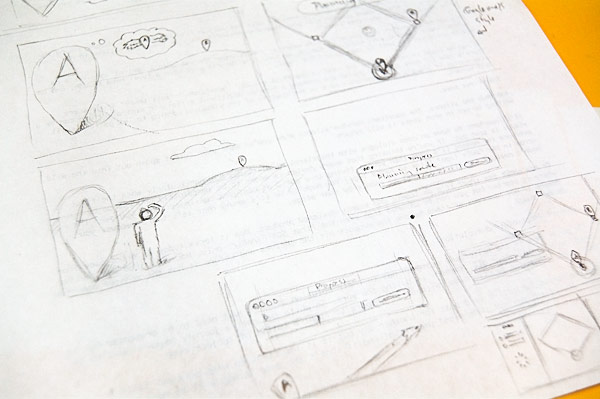
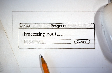
Sketching out ideas for the image you see at the top of this post
With the whittling done, the ideas the designer believes in are down on paper and ready to be developed further into the first visuals. This can be the moment in a project’s life where it’s most under the designer’s control and the most fun can be had. It is important, however, to keep a level head, an eye on the clock and not to get too self-indulgent.
Moving the design from sketch to screen provides its own challenges and can cause extra hurdles. Initial plans on colour, photography or layout can take a shape of their own on-screen, making us redefine and redevelop the design further. This is another stage where the designer will discover and rule out things that don’t work before the visual is ready.
It can be tough to call time on the road to the first visual, especially when reaching the almost there stage where further spit and polish could be applied but drawing a line on additional effort for minimal return can be a wise choice if there’s no discernible mark on the quality of the visual. We always present our best work but we have to recognise when to let go.
Passing First Base
And then silence. The sometimes nervous silence that follows when the latest spawn is released into the wild, waiting to see in what state it will return.
It’s a big moment, both for the designer and the client, because until now there have been two points of perspective for the project. Through the initial brief and the proceeding discussions, the designer will get an insight on the client’s vision and will seek to meet that with their own interpretations, but there’s still the potential for those mind’s eyes to be looking in slightly different directions. Those gazes start to converge from this point.
It’s important to have an open dialogue with the client at all times but particularly when the first visual is sent out. The belief the designer has in their solution doesn’t just need to be presented but it needs to be sold—after all, someone is buying the work—so while the entire journey doesn’t need to be explained, the major junctions do. Without it prepare to fight a battle of subjectivity.
Objective versus Subjective is a topic for another day but it is important to keep personal taste in balance. The client may not understand the visual and if that’s the case it may well be back to the drawing board, but if there’s something about it they don’t like—well, we can work on that.
In that situation it is important to find out why. “Just because” doesn’t cut it I’m afraid, so we have to dig deeper. If orange is your least favourite colour then I guess a design heavily featuring orange may not work for you personally, but does orange work for the design? Does it mix well with the other elements; does it help give it personality?
The benefit of an open dialogue is a respect for each other’s opinions and approaches and a preparedness for making the right compromises during the project’s life. The best working relationships come not from hierarchy but from mutual enthusiasm and engagement.
And the first visual, as much as the journey before it, is the launching pad for the success of the rest of the project and beyond.